Architectural identity with a play of lines and forms
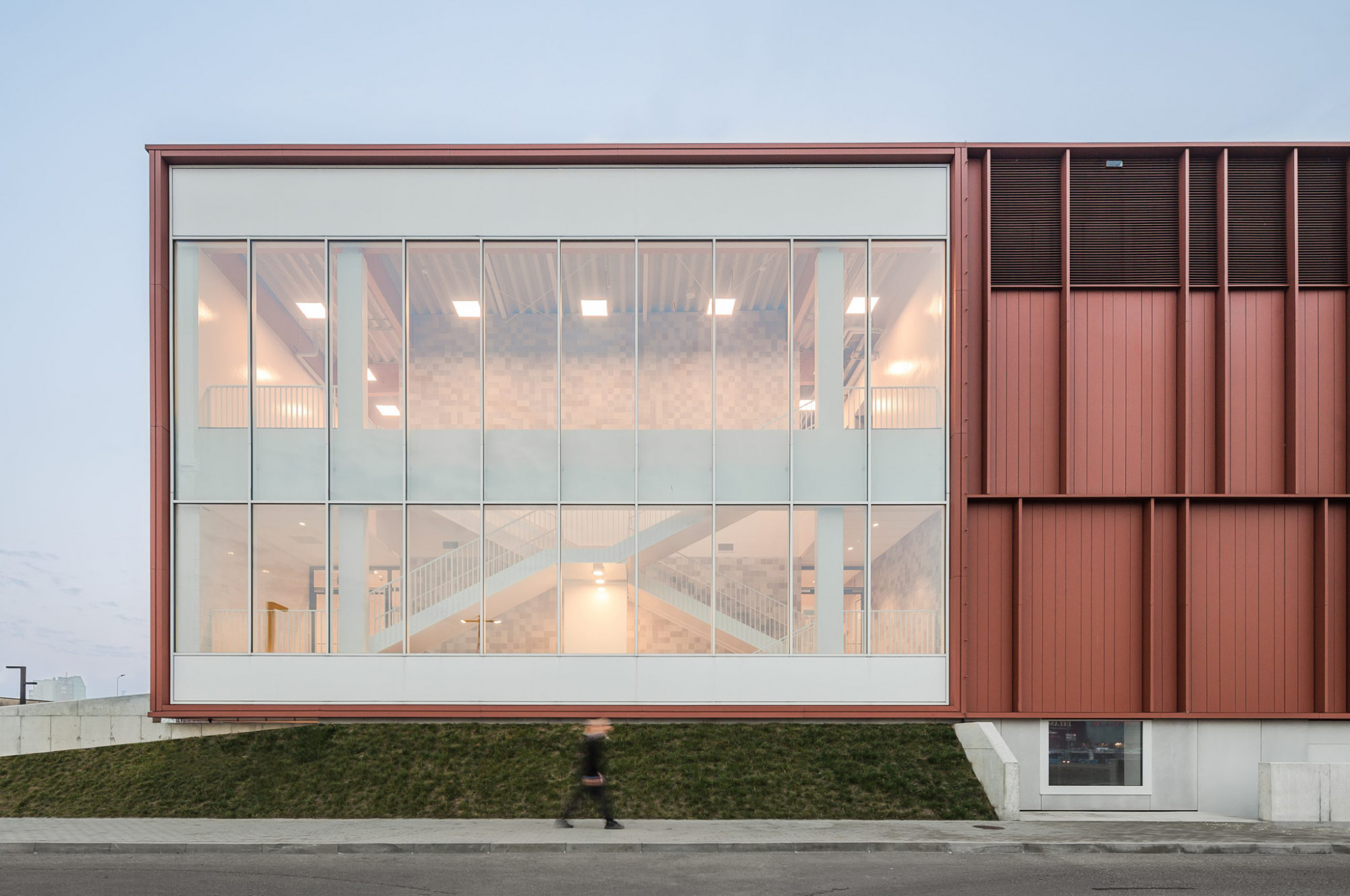
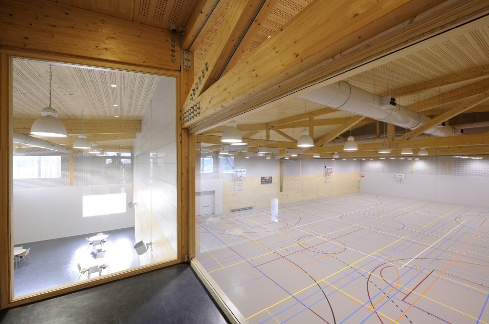
Identity and branding concept for a renowned Dutch architectural firm. Slangen + Koenis (S + K) is an architectural firm specialized in the field of public facilities and swimming and sports facilities in particular. Characteristics in the projects are raw expression, materialization, and transparency.
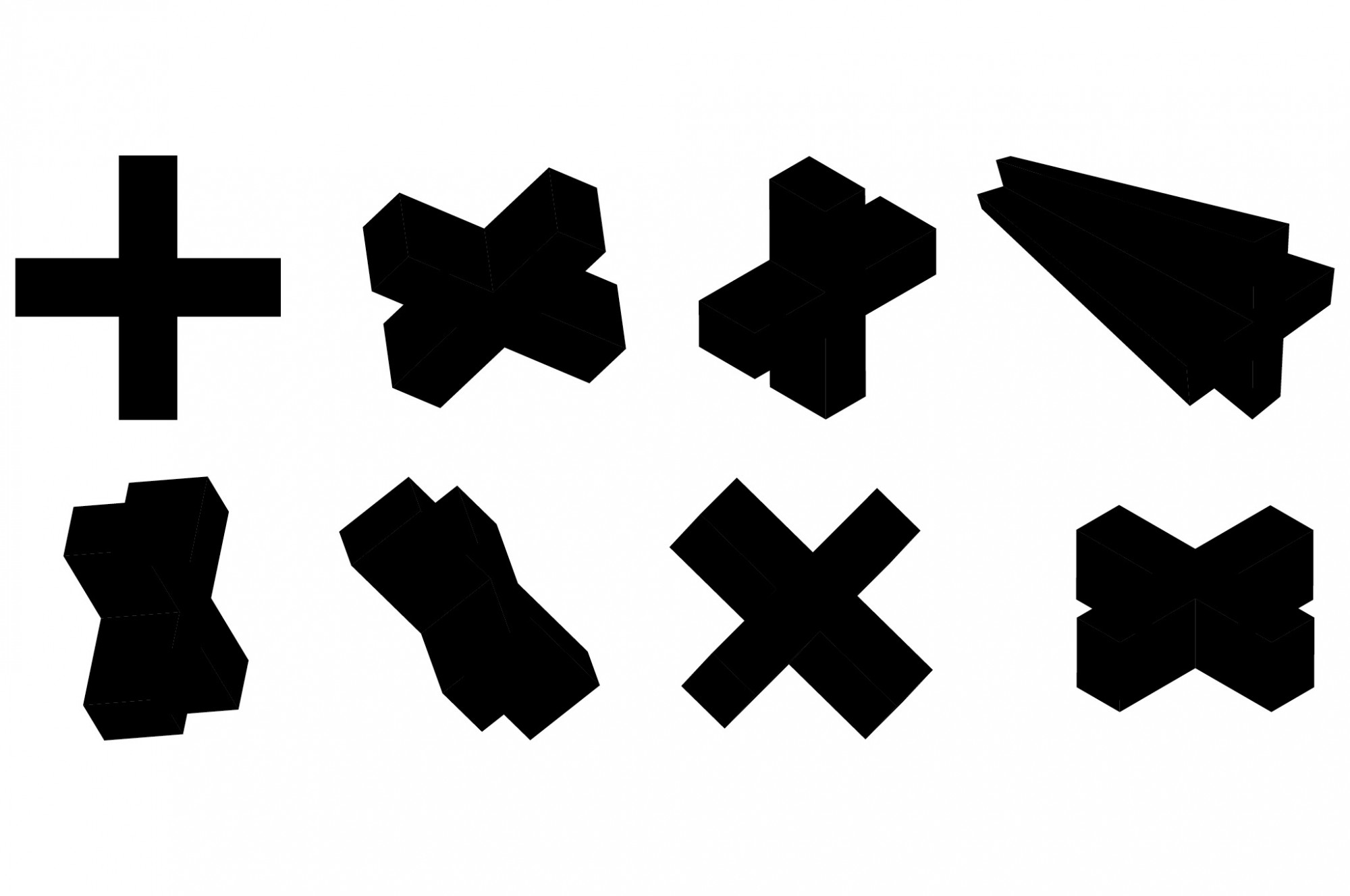
Plus sign as a connection
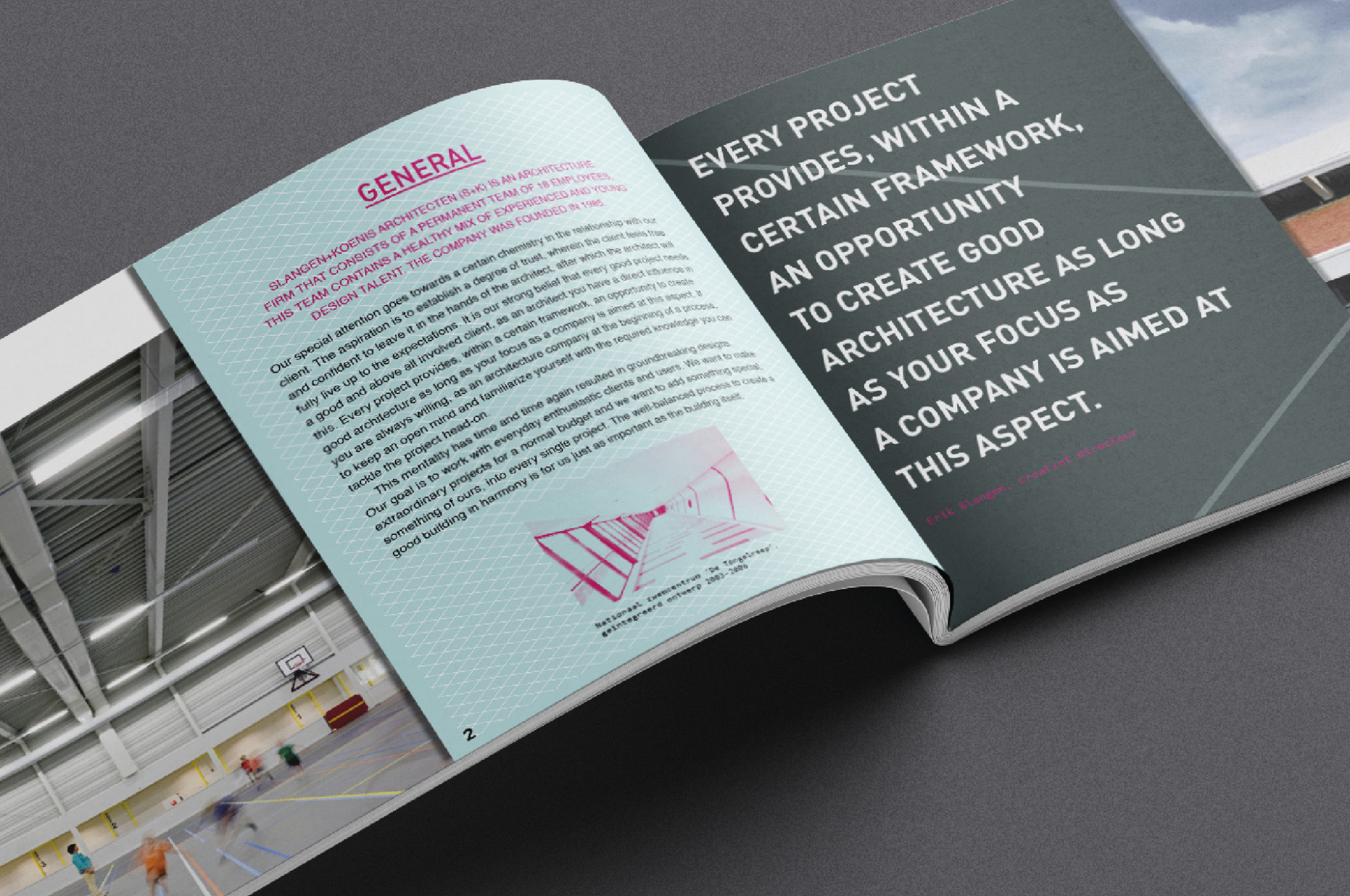
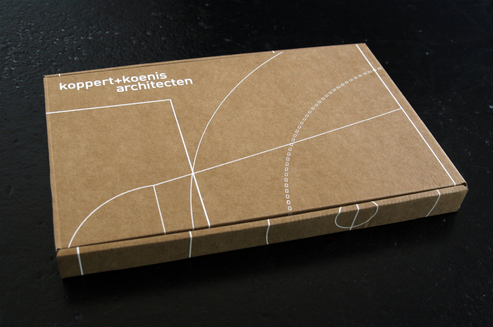
Smel was asked by Koppert + Koenis architects to develop a new brand identity. The challenge was to create a visual link between Koppert + Koenis architects, Makks process management, and the K + K Group. We wanted to create a dualistic brand structure in simplicity with one recognizable recurring style element. This is how we came up with the idea of connection and added value in the form of the plus sign. In the implementation of the identity, the font DIN has been adapted and 3 clear colors predominate. To make the identity more dynamic, we have added characteristic sports lines to the brand style.
Combination of luxury and edgy look
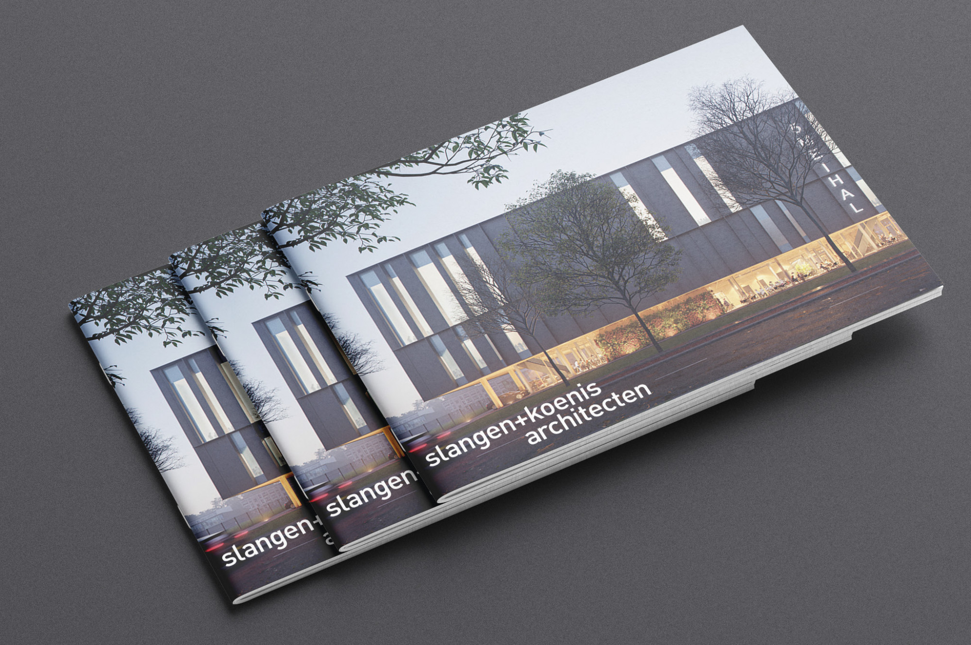
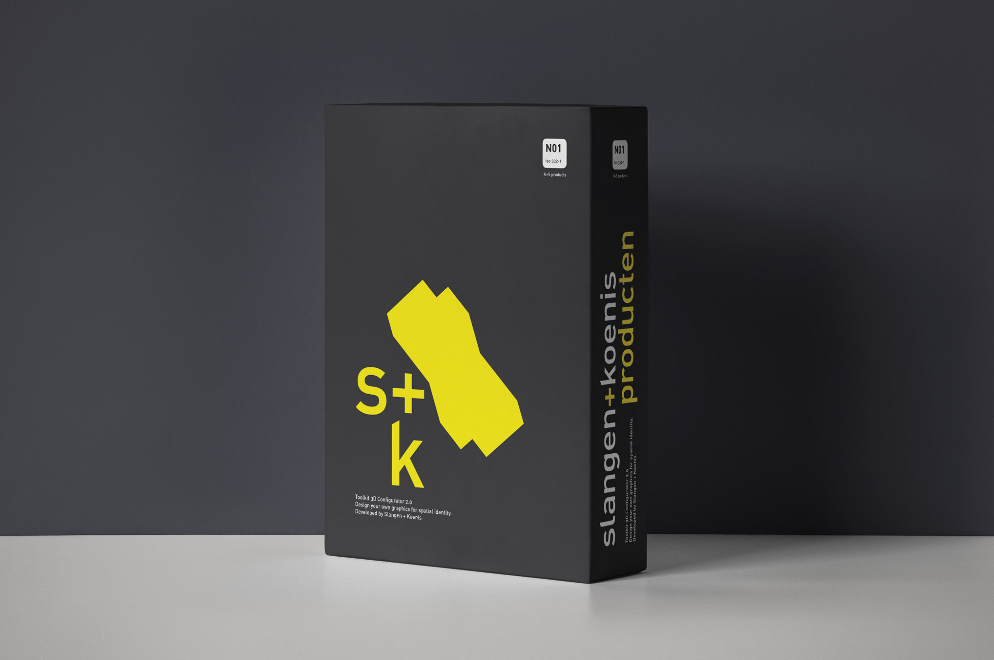
The architectural firm is now called Slangen + Koenis (S + K) and has grown into an internationally operating organization with 28 experts. Various means of communication have been made such as portfolios, corporate house style, and a website. Popular materials have been used such as cardboard with screen printing, but also relief ink for the logos on stationery and business cards.